Today we have a behind-the-scenes look at the work of our Visual team, courtesy of NSG Art Director, Conrad “Banknote” Kluck! Conrad will go over the process of putting together an art brief, how it informs our artists, and how it affects the final card art. If writing art briefs sounds interesting, remember that the Visual team is currently recruiting, and you too can help create Netrunner art!
What is an art brief?
An art brief is a (roughly) 1-3 page document we prepare for our artists to help them understand and visualize the type of piece we are asking them to create. It includes a wide range of details: specifics for the location, characters involved, individual essential details, or even just a feeling or atmosphere for the piece. We often include visual references, such as previous Netrunner art, pop culture references, images from Wikipedia or whatever else helps describe what we’re picturing.
Lastly, this brief also includes some technical details so that the artists are sure to give us file types that we can use and fit the card templates etc.
Why do we need art briefs? Can’t artists just do the art?
Asking an artist to take a card concept, no matter how simple or complex, and create a full piece without any guidance is a huge ask! The brief acts as an outline to help ensure the final piece meets our needs, and gives the artist a clear place to start from. Remember, we are paying an artist for their time as well as their talent, and if they create a stunning piece that isn’t right for the card we’re working on because we gave them poor guidance… that’s on us.
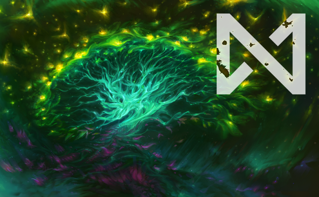
Some pieces and some artists can make do with very simple briefs, even just a sentence at times. Liiga’s World Tree is a great example; the brief could be boiled down to “A great glowing Tree in cyberspace”. Liiga clearly knows her way around depicting netspace, and odds are good we would get something stunning with just that sentence as a brief. (Though we did end up elaborating a bit more in the actual brief.)
But for more complicated pieces, or if we’re commissioning work from a newer artist who might be new to the setting, including more details helps us get a piece that better fits the aesthetic of Netrunner’s world and captures the feel of the moment depicted.
Depending on the piece, sometimes the team has a very clear vision of what we want. Take Reprise for example – I knew I wanted to see Sable bowing, while the results of her hacking attempts played out behind her. I included a lot of specific details, including photos of myself bowing as she is in the art, to help the artist really capture the feeling of this one moment.
Other times, the artist can really surprise us with an approach that we hadn’t pictured before. Hush was one such case; we gave Scott some elements to work with, but when he showed us the dome of silence, almost like an igloo in a blizzard, it was so much better than our initial ideas. It fit so perfectly into the setting for the Borealis Cycle, while still capturing the feeling of being in a small safe space amidst the hostile areas of netspace.
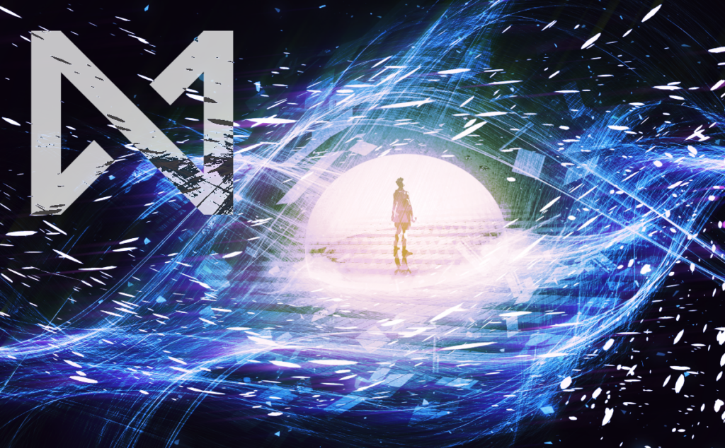
For reference, here’s the start of the brief for Hush:
An abstract visualisation of sound being dampened. This is a safer place created inside the netspace representation of a corporate server, a place that is usually hostile to hackers, where they are able to focus. The effects of corporate countermeasures (ice) are being reduced, but not completely nullified, and the hacker is more able to focus on their icebreakers to deal with them.
So, while the level of detail and how heavily the artists rely on the brief may vary, it’s always helpful to start from a strong foundation with lots of clarity and helpful communication.
Wait, who does the research for the art briefs?
We do! That is, the Visual team. Well, that’s partially true. Because our team has been one of the smaller ones in NSG, we asked for volunteers in other departments to help us out for the Borealis Cycle. Each brief writer volunteered to take a number of briefs. Some of these had very clear theming or specific scenes we wanted to depict – Time Bomb and End of the Line were both very straightforward. Others were very open-ended and left up to the team, or even the individual brief writer, to interpret. How do you depict Ontological Dependence as a concept? What kind of scene best shows Nonequivalent Exchange in action?
It’s been a lot of fun getting to dig into some of these subjects. I know so much more about Bladderwort than I ever thought I would, but I had a great time figuring out how that knowledge might inform how a Netrunner card would look!
What skills are needed to do an art brief?
I’ve found that curiosity is honestly the most important thing to bring to this process. The research can be a lot of fun, especially if you like to nerd out about a variety of strange topics. Of course good visualization and descriptive writing skills help a lot too, but because we do a lot of peer editing before sending briefs to the artists, it’s more important to be excited about learning and to guide our artists than it is to be the best writer in the world.
What are some of the fun easter eggs people have snuck into the art in the past?
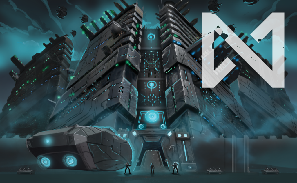
There are absolutely a few that come to mind. Mr. Hendrik’s family photo of the triplets with their dad was fun to include. I asked for Poison Vial to have a Mr. Yuk sticker to include something from my childhood. My personal favorite has to be Hostile Architecture however. The features of the building itself draw upon the kind of wall-spikes and “anti-homeless” bench designs that are utilized in hostile architecture approaches. But my favorite detail is the pair of benches along the wall on the right. As if the decidedly unwelcoming drones, gun turrets, and gate weren’t enough of a deterrent, Weyland made sure the benches here are uncomfortable so folks can’t sleep on them. To me, that’s the kind of over-the-top cruelty that borders on absurdity which is essential to Netrunner’s world.
