Hello everyone, @Dis from the Creative team here, I hope everyone is digging Downfall’s Spoilerpalooza so far! A few weeks ago NISEI’s lead designer @crithitd20 offered some fun insight into the design process for MirrorMorph, the HB identity in the upcoming first Ashes release. Since it was so well received, both internally and externally, we thought Spoiler season should give the readers articles going into the downstream work that happens between designing cards and the print-on-demand version of the card being available to you all.
Thus, we will leave the airy collegiate halls of the design team behind and descend into the basement of One NISEI Plaza. Pass the community team’s Hyperbolic Scoops Chamber, even below the mooring for Organised Play’s Boat. In the dim distance you hear the repetitive clang of presses and a sour acrylic scent assaults your nose. In the bowels of this windowless vault you behold the smoking Printing Presses and the steaming Artist Workshops, poised precariously over a bottomless pit from which no money escapes. You have arrived at the Lair of the Creative Team.
We’re going to follow two cards, one for the Corp and one for the Runner, as they get their initial theme, go through the art commissioning process, and finally get some flavour text. Anyone who can’t wait for scoops can zip to the middle and the end of the article right now for the full card images, everyone else can follow the process we worked through.
When Creative did the initial collaboration with Design, there were only a few dozen inchoate card concepts and suggestions, with only the Identities really fleshed out as ideas. The IDs served as the tentpoles of our thematic framework and we planned to try and tie a lot of the cards into the stories of each of these particular Corps and Runners. To ease the transition to NISEI’s timeline, it was decided that all the Corps would be based on canon entities existing in FFG’s New Angeles featured in the wonderful Worlds of Android artbook.
With this we knew that MirrorMorph was going to be the HB identity – but who *are* MirrorMorph?
To go on we have one card and one page in the Worlds of Android, and a lot of the latter is tangential fluff. But from these parts you can build a foundation and then work up; MirrorMorph are about ‘new functionality’ for bioroids, to ‘fulfill more roles and functions’, and their card rewards the corp for doing do lots of different things at once. Whilst Cerebral Imaging advances the software of bioroids, MirrorMorph iterates upon the hardware of the mechanical form. They push the limits of what can be wound into the servos and channeled into the optical brains of bioroid (and bioroid-adjacent) products. Rather than one big project they will have a hundred ongoing at once; one lab might be working on the glossiness of the Adonis’ hair, whilst the one next door improves a surgeon’s fine motor control, or tries to port bioroid advances to human prosthetics. A feeling of industry and precise scheduling pervades the theme, something that you will certainly get from the ID’s gameplay! A framework was built on FFG’s foundations, now it needed to be filled in on some cards.
When Design returned from their contemplation on the mountaintop, they had over a hundred card designs to be individually themed and tested. Within this mass, a subset of the HB ideas were clearly intended to work well with MirrorMorph by having ways to usefully spend a click once per turn. It’s one of these cards we’re going to follow today, the asset HB-6, which has the following ability:
[Click]; gain 2c. Use this ability only once per turn.
This is not the only line of rules text on the card. But that other line wasn’t really relevant for our theming process; what was more interesting for Creative was that this was non-unique, not a bioroid, and obviously intended to be a basic economic card rather than a special tool or win condition. We started in the same way we did for every card; everyone makes a big old bag of suggestions, then we try to synthesise a better name out of them in a live meeting. Lots of prosaic names like Manufactory Centre, and Nanoassembler were tried and abandoned, before we focused in on MirrorMorph’s core competency, their economic backbone; creating Bioroid brains. HB performs this Promethean labour via channeling an optical connectome into a glass substrate; sketching neurons in crystal and light. Neural Channeler was a brief idea but sounded a bit too fuzzy, plus we didn’t want to expend such a broad concept on a single card. So we decided to go more granular and bring it down to just part of the process: the physical carving out of the glass synapses by Haas’ nanobots, occasionally referred to as “etching” in WoA (an amusing counterpart to how silicon chips are etched via photolithography today). Bring back the fun prefix from an earlier suggestion to get Nanoetcher (in the Android setting people are probably bored of Nano- on everything by now), and this card becomes one of the physical facilities where the brains are carved, before they head off to the brain-taping warehouse. Something wasn’t quite there though, the named needed something more to feel like real object; Nanoetching Lab? Facility? Calvin brought up the word Matrix, which was a snap keep. For those not up on their latinate roots, “Matrix” is ultimately derived from the Latin word for womb/mother, in a parallel to how we get the word “Maternal”.
The Nanoetching Matrix is the first step in a bioroid being born.
With a name and theme down, the next stage was writing the art brief, but before we go into that we need to have an aside on how NISEI is going to generate and apportion art.
Art costs more than we think most people would suspect, especially high quality art like you see on the three homage connections spoiled on Monday. Fan projects often get round this by taking existing art available on the internet without the artist’s knowledge, but NISEI wants to hold itself to higher standards. All art will be purchased or donated, properly credited, and be entirely within NISEI’s rights to distribute as game and promotional material. For most art, we leave print rights with the artist so they have the opportunity to generate a continuous revenue stream from what they make for us.
However when planning Ashes, it was clear that the funds available would not cover 60 odd pieces of art at the level we wanted. So we made the decision to prioritise artist commissioned art for people, objects, and activities taking place in the physical world, to give them a sense of consistency and reality. Virtual environments and abstract concepts would have to be done a different way; they would be generated internally by the graphics team mainly using a technology called Deep Style, in the Deep Dream family of algorithms. This open source algorithm reconvolves (Editor note: “roll together”) one image using features extracted from a training image. We would be able to use photos and base graphics contributed by the NISEI team and other donors, as well as open source images, then enhance them to produce what would hopefully be a consistent and vibrant style for virtual environments/programs/ice/abstract concepts. This will mean there will not be any of the beloved cyberspaces from Liiga or similar in Downfall (though fingers crossed some will be in the budget for later sets), but we hope you’ll find what we’ve come up with evocative and immersive in its own way.
The key player in the production of these arts is our dreamiest artistic talent @Krembler, and we’ll hear from them about how they were press ganged recruited to NISEI and their thoughts on Deep Dream.
So I got into making Netrunner alt art cards as a way of letting my brain destress while learning to code at a career change bootcamp course. Many of you will have seen my Adam + Directives set that I did during this time and they were a great way to learn some basic digital art techniques. I was using GIMP at the time as I was completely broke and needed a free way to do art stuff. This worked for a long while and if anyone is wanting to get into making digital art, it’s a great place to start.
When the cancellation announcement happened I stepped up my production of alts as I initially wanted to go out with a bang and make some really fun stuff for the community to enjoy before the game ended but with the creation of NISEI and the promise of NEW THINGS I was overjoyed to see such passion and it really inspired me to pick up some new tools and learn how to use them to make alts. One of these tools was Google Deep Dream.
Deep Dream is an amazing thing. It uses machine learning to blend different art styles together to make something completely new. I got super interested in it when making my Krembler Cards alts as a way of learning different digital art technique. It very quickly became a mainstay of my art workflow when making alts.
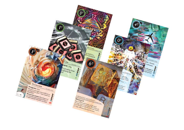
It has its limitations but it is a tool like any other that should be used for some things but not others. I love the idea of using an AI to make art for a cyberpunk card game. It seems super self-referential but I have this tick in the back of my brain that wont let me make anything without having some kind of joke or reference in it and Deep Dream let me do that to the most ridiculous level with my Self-Modifying Code alt that I made a while ago.
It seemed natural that when Pat asked me to do art things for NISEI that I use Deep Dream for it. I’ve been chewing crayons for NISEI for the better part of the last two months and some of the art briefs have been weird and wonderful enough to make your head spin (Thanks Dis!) Trying to wrap my brain around how to make something closeish to the fever dream inspired descriptions I was handed has been a super interesting challenge and one that has been really fun to work on.
The timescales are tight and Pat wielded the editorial whip like a pro but we got there. It’s been and remains a heck of an undertaking but one I am delighted to be a part of.
Thanks Dunks. Back to the card!
If Nanoetching Matrix was slated for commissioned art, we might have done something with an external view of the machine, macro scale brains being carved, and so on. However it was placed on the Deep Dream list and so needed to be abstract, clean, and frame filling. The theming described earlier in the article made the brief very simple:
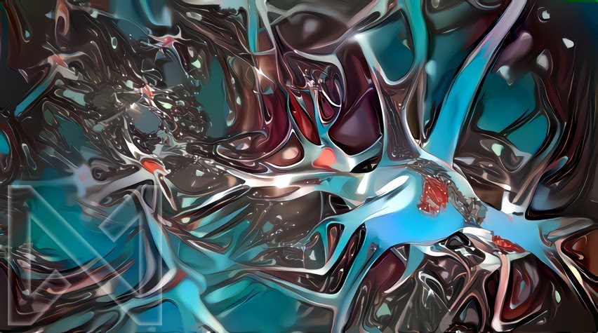
*Neurons and synapses, but made of glass. Complex structure would be good. Yeah Cool and calm colour tones suited for HB card*
Pretty much immediately @Krembler came back with this art, our very first piece specifically Deep Dreamed and edited for Downfall, and it looks amazing. There weren’t any iterations as it felt this matched the brief right away. How good it looked was a great relief, and we became confident that Deep Dreaming roughly half of Downfall’s art was not a fever dream.
With art in hand and a mostly firmed up rules text, it was time to write the flavour text. Creative doesn’t care that much about the actual text, we just wanted to know the character count. With roughly 110 characters of rules text estimated by the Rules team, we had a spacious 200 characters to play with for flavour, and could indulge in some whimsy. Ideally we won’t push on that limit except in service of elucidating an arc or character story, as flavour text works best when its concise and snappy. We knew the components; there would be some reference towards birth, something about glass being etched or cut, a reminder of the nanobots, but those ingredients got stirred back and forth over the course of a long conversation thread before we arrived at something that felt right and was a safe 160 characters long. We considered attributing it as a quote to some existing character, but were worried about space and felt it had a dispassionate neutral tone that would work as a stand-alone statement.
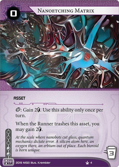
At the scale where nanobots cut glass, quantum mechanics dictate error. A silicon atom here, an oxygen there, an erbium out of place. Each bioroid is born unique.
And with that Creative was done with the card until it came time for the final layout:
Moving on to the Runner card, we’ll show you a very different method of theming. For Matrix we had all these top-down ideas ready to apply, but for this card the bottom-up theme entirely followed the design, unconnected to the Criminal identity you see teaming up with Kati Jones on the recent GNK playmat and answering questions from rogue journalists.
The design name was Lucky Charm, a Criminal hardware that spends itself to apply a very spicy bit of rules text. The text immediately before and after this bit changed a lot over the development process, so once again Creative focused on the core functionality:
Prevent a run from ending due to an effect of a Corp card
Creative decided this name was an instant hit, as it encapsulated the somewhat broad effect so well. This ‘lucky charm’ the Runner keeps would thematically do whatever the runner needed to get past effects like Nisei Mk 2 or Border Control, without tying things down to an over specific method of action. Much like we don’t need to go to deep on who the Easy Mark was or how they were grifted. This wasn’t quite the case with the rest of the charm cycle, but you’ll have to wait on those as they didn’t make it to Downfall, and might not see the light of day at all.
So after a few minutes discussion we had the name, but now what does this thing look like? Has there ever been a Runner device with a vaguely themed broad ability to protect you? Of course; Sacrificial Construct. Construct protects you from destruction, whilst Charm protects you from failure. Now it just needed some unique flare, and we had an art brief.
*A small blue electronics box à la Sacrificial Construct on a metal table in a dim room. It has leads waiting to attach it to something. A 4-Leaf Clover logo is clearly visible on part of the box. A couple of lights in the box twinkle with potential energy.*
We’ll now turn to the fantastic Art Coordinator @bluehg, to see how this brief went through the commissioning process to arrive at the glorious art you’ll see at the end.
I trawl a lot of websites, such as DeviantArt and ArtStation, to find artists for particular cards and cardtypes I have in mind. This little piece by Elizaveta Sokolova convinced me she’d be the perfect person to bring life and (ahem) charm to a relatively innocuous piece of hardware.
@Dis writes most of the art prompts, and I modify them with references, a color palette, and a mood. The only reference I added to this one was a link to the original Sacrificial Construct art. Later I did have to reference what a four leaf clover looked like, because when communicating with artists who don’t share your native language, it pays to be clear! For mood and palette I gave her this:
Mood: Lonely, spare and abandoned, but with a spark of activity.
Palette: Cold blues with a bright warm color as an accent.
The terms negotiated with the artist are kept between me, the artist, and my supreme overlord Holly Chandler, but generally we have an agreement to send sketches and WIPs. Below you can see the initial sketch for Lucky Charm:
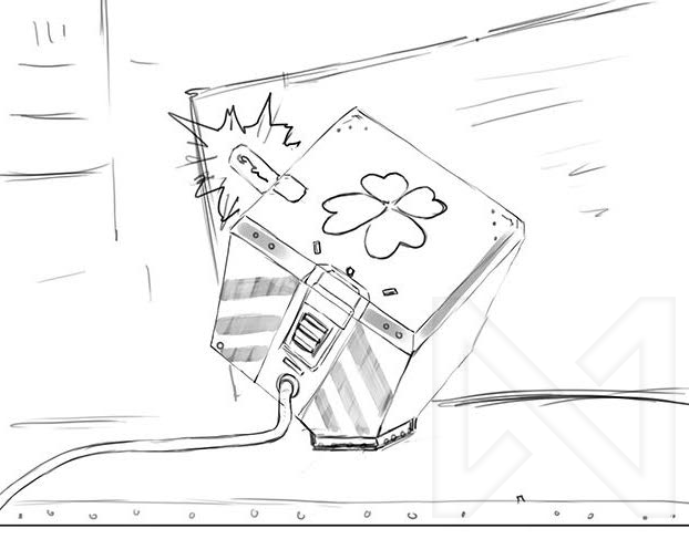
I loved it, thought it was perfect for what we wanted. The rest of Creative and I had the idea that these little easily modifiable boxes like Sacrificial Construct were mass produced by a small company and altered by a hobbyist to suit a variety of functions. Who knows? Maybe there are more, similar constructs out there! You might even get to see more in the future…
After a sketch is when we have the opportunity to make any large corrections to scenes, composition, and pose. Some artists send me a couple of sketches, with differing levels of detail depending on the artist, and let me pick/combine various aspects of each. If there are big corrections to be made, this is the stage they need to happen. Once an artist starts coloring, it’s *much* harder to modify a pose.
Shortly after that, Elizaveta sent me a near final colored sketch.
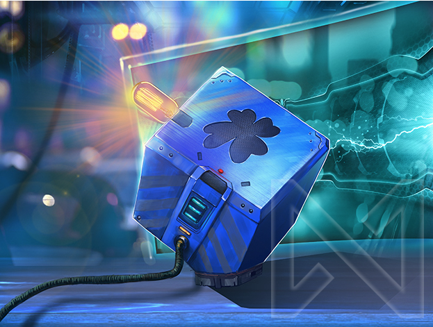
And this is where I encountered a problem I didn’t expect…There’s a screen with a frame in the background! These are very rare in the Android universe, with the only ones I can think of off the top of my head owned by the luddite Omar Keung on Frantic Coding. Lesson learned; include that specific detail when talking to artists not familiar with the universe. We had two choices; be fine with the art as is, or go back to Elizaveta, and see if she’d change it. When changes need to be made this late in the process, I normally negotiate additional payment to the artist for extra workload. Their time and talent is well worth the money to portray a consistent vision of the universe. I paid Elizaveta a little bit extra, and she modified the screen.
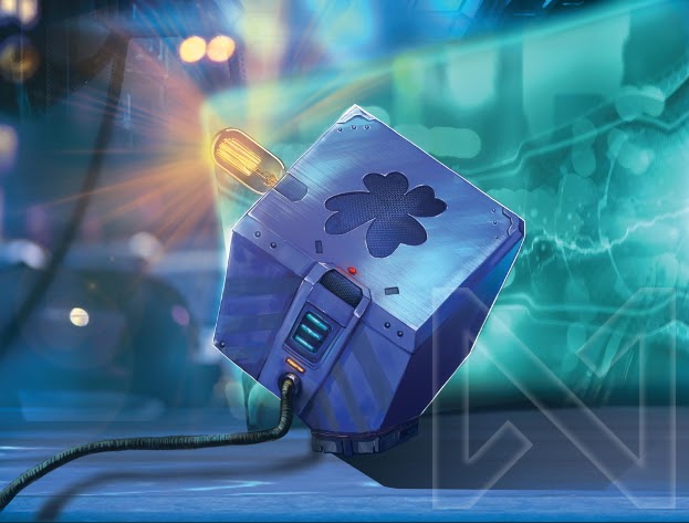
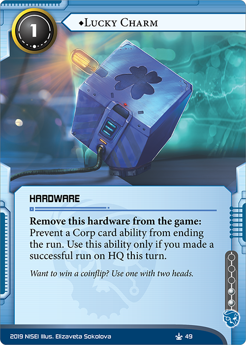
And here’s the final image, now with a holographic screen in the background! The image is cute, simple, direct, and most of all evocative. I really enjoyed working with Elizaveta – she was extremely positive and receptive to feedback. I highly recommend her work to anyone who enjoys her style! We’ll definitely be seeing more cards from her in the future.
Here’s the link to her DeviantArt!
That looks great Pat!
With the art set, we then needed to choose a flavour text. Although the line of rules text on this card gave us a lot of space for flavour, we wanted something relatively snappy, just like the card itself. Since there was a possibility of more charms across the factions, we couldn’t tie it to any particular Runner or it would make those other texts problematic. But perhaps there was a character existing in the lore who was already bound up in slightly out there quantum technology? Mimicking other prose about Oracle May meant we didn’t have to explain how the Lucky Charm might function (apart from ‘very well’). Now we just needed something pithy to say that would fit in as one of her kōans. One idea was to reference something people used to hate but that Lucky Charm would alleviate – the ‘coin flip’ nature of Caprice’s psi games. We liked that, but really had to work to cut it down to as few words as possible. After all, the most important part of flavour text is knowing how long a segment to write and not put something extraneous after the end. In other words, keep it short.
Want to win a coinflip? Use one with two heads.
