With Elevation, NSG’s Narrative and Visual teams worked together to make some long-desired updates to our cards’ graphic design.
A Fresh Identity
One of the big changes we knew we had to tackle in Elevation was adding pronouns to Runner identities. This had been a long-standing desire, both within NSG and expressed by the broader community.
NSG has featured runners (among other characters) whose pronouns were important to their identities before, whether cis or trans. However, because the characters’ pronouns were not present on the card itself, players weren’t sure how to refer to them. We relied on the short fiction we published on our website, the small informational cards in our packs, and word of mouth, but none of these tactics felt like they could adequately reach the players.
Putting that information on the Runner identities alongside their name and subtitle was the clear move, and is an improvement both in terms of Netrunner’s player experience and narrative design. By providing pronouns, we invite players to refer directly to the characters they are playing as (or the characters they are trying to destroy), and think of them as living people (or all-consuming digital entities, as the case may be).
Very early, we established that simply tacking a pronoun box onto the existing frame wasn’t the right approach. Pronouns are an inherent part of a character, and we wanted the frames to incorporate them as an inherent part of their design to reflect that. Working with NSG’s new graphic designer, Kelli—if you’ve used our new token set, you’ve seen her wonderful work already—we explored a number of options for both placement and style.
Redesigning the Runner identity frames afforded us another valuable opportunity to reconsider the information hierarchy on the cards, and to address a pet peeve we’ve had for a long time: the spotlight on Link. Often, when a new player picks up a Runner identity, one of their first questions is “What is this 0 in the upper left corner?” They often get a very disappointing answer: “Oh, don’t worry about it, it’s not important.” With the mechanic of Trace being deemphasized in recent sets, the prominence of Link on Runner identities was feeling increasingly out of place.
For all Netrunner cards aside from identities and agendas, the top left corner shows a very important number: the cost. This new design moves the Link and MU limit values a little lower, and greatly reduces the size of the Link symbol to match MU. The information is still there, for the few remaining cards that use Trace and in case designers want to revisit Trace or Link as a mechanic in the future. But no longer will Link assume the same visual importance as a play, rez, or advancement cost!
Once we knew we were going to be reworking the Runner frames, it seemed only natural to give our Corp identities the same glow-up. But there were still opportunities to give a little more personality, character, and context to these cards, enriching the stories players get to explore during their games.
Before we go any further, why don’t we take a look at the changes in action on a new pair of Runner and Corp identities:
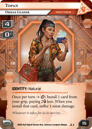
Topan: Ormas Leader
Anarch Identity: Natural
Pronouns: They/Them
Minimum Deck Size: 45 – Influence: 15 – limit: 4 – Base : 0
Once per turn → : Install 1 card from your grip, paying 2 less. When you install that card, suffer 1 meat damage.
Whatever it takes for us to survive.
Illustrated by Zefanya Langkan Maega
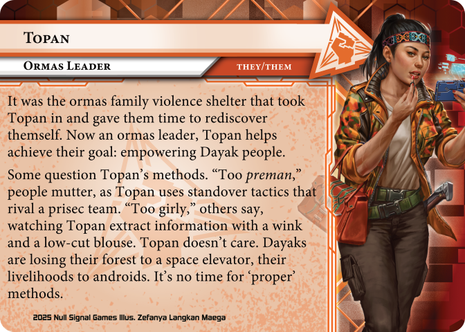
Topan: Ormas Leader
Pronouns: They/Them
It was the ormas family violence shelter that took Topan in and gave them time to rediscover themself. Now an ormas leader, Topan helps achieve their goal: empowering Dayak people.
Some question Topan’s methods. “Too preman,” people mutter, as Topan uses standover tactics that rival a prisec team. “Too girly,” others say, watching Topan extract information with a wink and a low-cut blouse. Topan doesn’t care. Dayaks are losing their forest to a space elevator, their livelihoods to androids. It’s no time for ‘proper’ methods.
Illustrated by Zefanya Langkan Maega
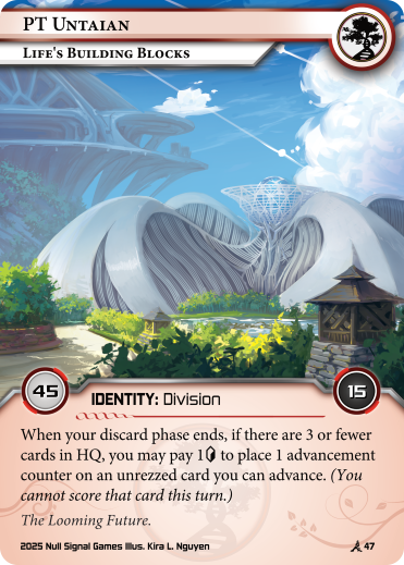
PT Untaian: Life’s Building Blocks
Jinteki Identity: Division
Minimum Deck Size: 45 – Influence: 15
When your discard phase ends, if there are 3 or fewer cards in HQ, you may pay 1 to place 1 advancement counter on an unrezzed card you can advance. (You cannot score that card this turn.)
The Looming Future.
Illustrated by Kira L. Nguyen
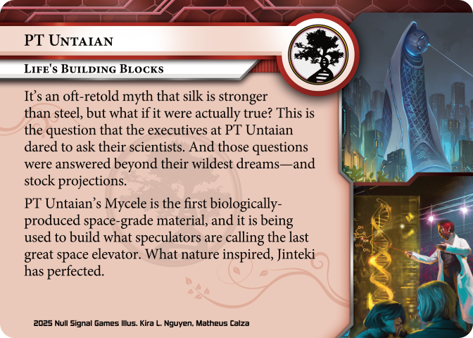
PT Untaian: Life’s Building Blocks
It’s an oft-retold myth that silk is stronger than steel, but what if it were actually true? This is the question that the executives at PT Untaian dared to ask their scientists. And those questions were answered beyond their wildest dreams—and stock projections.
PT Untaian’s Mycele is the first biologically-produced space-grade material, and it is being used to build what speculators are calling the last great space elevator. What nature inspired, Jinteki has perfected.
Illustrated by Kira L. Nguyen, Matheus Calze
And yes, the vigilant preview-enjoyers among you will notice that these are the second identities for their respective factions that have been previewed so far. We are pleased to confirm that every faction will be receiving two new identities in Elevation.
On the Flip Side
At the risk of launching one thousand custom card prompts: identities are not meant to be shuffled into a player’s deck. So why are their card backs the same as every other playable card? These card backs were an opportunity; they were a canvas; they were free real estate.
We thought of other card games that have found their own uses for the space. Ashes and Worldbreakers, for example, both use their equivalents of identity backs to show off more of their character art. Perhaps because alternate uses of identity backs were first discussed in the Narrative channel in NSG, we quickly settled on filling the space with story instead of anything else. Arkham Horror: The Card Game was brought up as an example of a game that included short biographies of its Investigators on the backs of those cards, and we wanted to try our own take on that.
We went through many iterations, trying to find the right balance between readability and aesthetics, and we’re extremely happy with what we’ve landed on. Each identity back can hold a little under one hundred words of text, allowing us to fill in some key details of a given identity’s backstory or motivation. We’re incredibly happy with how the design elements from the new frame are carried over to the reverse side, bringing a level of cohesion to the card as a whole.
It also served another purpose for the Narrative team during the production of Elevation specifically. With 14 identities, we couldn’t hope to have a piece of short fiction for every single identity publish-ready during preview season. But 14 under-100-word pieces of flash fiction? That was very feasible. Of course, we’ll still be writing short stories, but in the meantime, no one should be left wondering “what is this character’s deal?”
An Artist’s Agenda
Our identities aren’t the only frames we felt deserved some attention in Elevation. The circular art frame on agendas has helped distinguish them from other card types, and set them apart as the most important cards in the game. However, the difference in shape also presented some challenges.
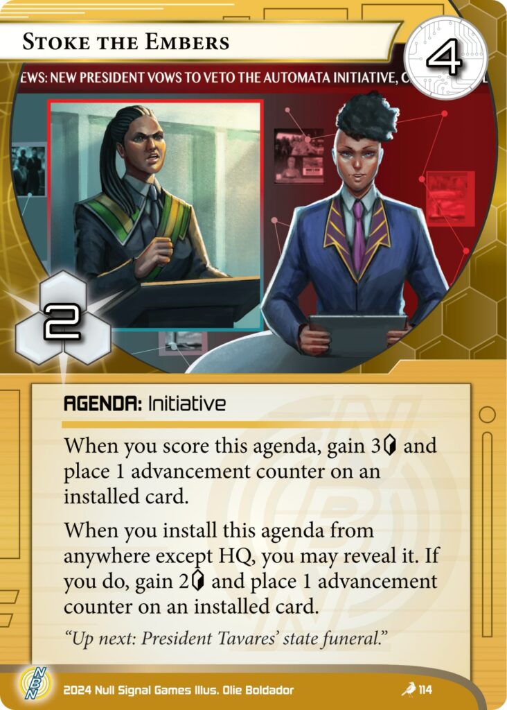
While we provide our artists with our frames to work with as they work on their illustrations, it can still be difficult for artists to arrange compositions that fit neatly in the unusual space. On top of that, it can make certain elements even more complicated. As an example, consider the news crawl on Stoke the Embers. Normally, the chyron would be at the bottom of a broadcast, and in Olie’s initial sketches that was the case. When we put the illustration into the agenda template, though, nearly half of the words were lost.
In reworking these frames, we wanted to maintain a visual consistency between the old and new agendas. This would not be a total rework like the identity frames were, but focused on expanding the art space to a more conventional shape. We also wanted to keep some of the rounded elements, so it would be harder to accidentally confuse agendas with assets or other card types. Ideally, if a new player were to put a new agenda next to an old one, the differences should not lead to any confusion.
By keeping one rounded corner on each side, we maintained the unique look of the agenda frames, while expanding the art space to be both easier for artists to work with and more eye-catching for players. You’ve had a taste of the new agenda frame in the card fan, and keep your eyes peeled for the full frame as the agendas of Elevation are previewed in the near future!
We hope these changes add depth to the stories you tell with the latest set, and elevate your experience of a card’s art, storytelling, and gameplay.
Join us in Kota Kalimantan when Elevation releases on April 24th 2025!