Zoe
Hello Runners and friends, I’m Zoe, NISEI’s newest addition to the development team. However, I’m here today not as a developer, but as a new member of the art team. Along with Akira, Krembler, and Nicita, we’ll share spoilers for five new cards from Uprising and discuss the art process behind them.
When I made the jump from playtester to NISEI member, I didn’t expect to make art. I’ve got some fine motor control issues, and hadn’t really attempted much art since grade school art classes. A moment of tremors destroying hours of work can be pretty discouraging, especially when you’re just a kid. Reading about the DeepDream art my NISEI peers created for Downfall was the first time in a long time I thought “hey, I might be able to do that.” Looking at our art tracker, I noticed that there were still some holes to be filled for Uprising, and figured I’d give it a shot.
The first card I worked on is Cordyceps, a Shaper virus in a similar vein to Pelangi. Cordyceps are fungal parasites that infect the bodies of insects and develop some truly gross looking fruiting bodies. They take a lot of different forms, but the most famous are the ones that create “zombie ants” as the fungus takes control of the insects’ bodies.
I started off with a source image of a bullet ant, and added tendrils and other fruiting bodies from both scientific reference photos and 19th century scientific illustrations. After a few layers of Dreaming, I shared my work with the rest of the DeepDream team.
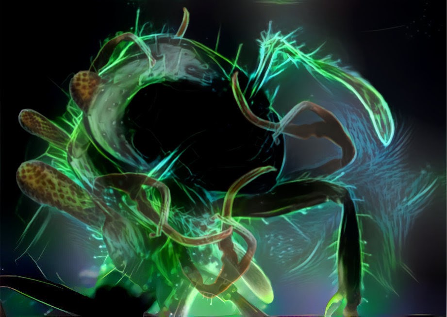
Krembler then stepped in with several additional layers of detail, color, and texture, creating a final version that really pops and teaching me a bunch in the process.
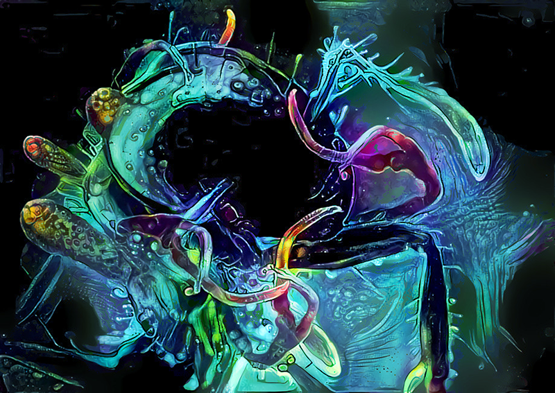
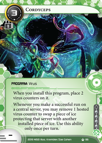
I’m especially fortunate to have had Krembler’s help early on, as he certainly had his hands full with some extraordinary illustrations of his own.
Krembler
So F2P went through a great many iterations, more so than any of my other Ashes Cycle pieces. It’s actually the one I started first for the set and is one of the last ones that I finished. The idea was to make a kind of retro-looking arcade-style game screen that brings the feel of microtransactions to the fore.
The original brief was a space invaders-style game screen where the bullets coming from the player’s tank were credits. I tried a bunch of stuff for this and got frustrated with many of the elements of the piece. The enemies were wrong, the player’s ship was wrong and the background just didn’t stick. In one iteration, I tried to capture the feel of the ’80s tank game Battlezone and for a couple of weeks I was stuck trying to make this neon line-based tank look good. It never did.
I eventually hit on a winner when my partner Clair was rearranging our Lego collection and picked out a number of Lego mechs that she had built earlier in the year, one of which was a blue, ice-based transformer-looking thing. I had been looking to make some art that incorporated some of Clair’s Lego structures for some time as she has made some fantastic things over the years, but this one seemed to fit.
I find that Lego is a great tool for mocking up scenes and lets me visualise an idea very quickly. It also lets you find the right angles and lighting for elements of a scene without too much fuss or hassle, and here it was a winner throughout.
It is a nice throwback to my own childhood that this piece incorporates Lego as it also had to feel very much like a retro game, and I went through many styles before I settled on this one. I did this in a classic Game Boy pixel piece style, a 2D NES style and finally settled on this as something that I feel kind of evokes playing a game on an old CRT monitor with late 90s-style graphics, with a much higher resolution of course. The scene was Dreamed several times using vastly different styles, and elements from each were extracted and overlaid on top of each other using masks and various effects to produce the final composition.
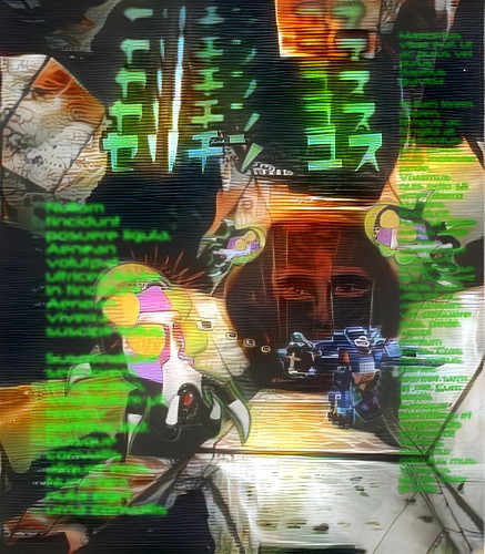

To me, this feels like the type of game that rewards twitch reaction playstyles and gives the player a bonus when they make a fast purchase without thinking in order to keep playing. A literal credit sink for the player that uses casino tactics to keep you playing, and paying, in the style of the early 2010s mobile games.
Zoe
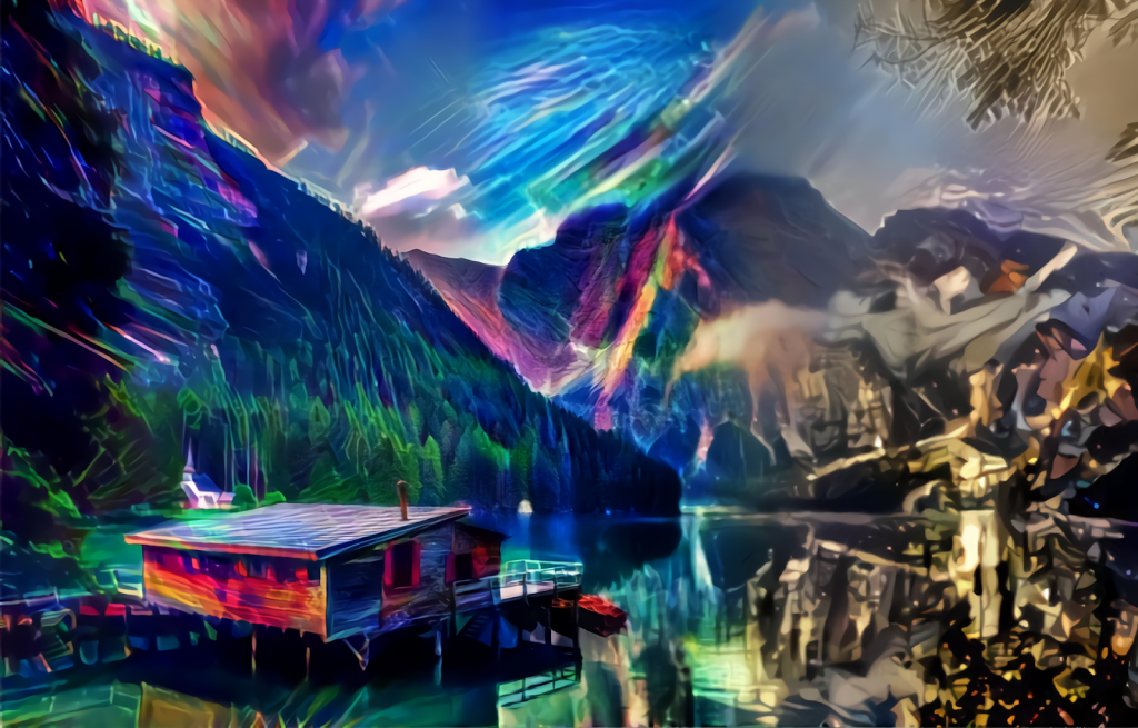
I’m also excited to share my first solo DeepDream piece, an HB operation. We were given a pretty open-ended description for this one: “One virtual landscape being transformed into another one. Theme: with a wave of the Corp’s hand they can change a more organic scene into a bunch of geometric shapes.”
I began with an already-beautiful picture of a boat house in Italy, with a lovely view of forest on one side and mountains towering over the lake. To retain the natural beauty of the organic side while evoking cyberspace, I layered a few Dreams trained on images of neon lights and lasers. My priority was introducing that color scheme, and adding vibrant lines made of light.
The mountain side of the image was set to become more geometric and uncomfortable. To create this effect, I Dreamed the mountains with style images of the New York skyline. The bright lights and human-made architecture clash with the organic shapes of the mountains to create an area I’ve come to refer to simply as “hell”.
![Scapenet
HB OPERATION: Gray Ops
1 cost, 2 inf.
Play only if the Runner made a successful run during their last turn.
Trace[7]– If successful, remove 1 installed chip or virtual card from the game.
The Net is the consensual hallucination of the world’s electronic architecture. *Our* electronic architecture. Don’t get mad when the Runners succeed—change the rules.
Illus. Zoe Cohen](https://nullsignal.games/wp-content/uploads/2020/03/26104.png)
Akira
I was looking through the art briefs for something that would inspire me to test out my improving DeepDream skills. I’d grown as an artist already – compare Congratulations to Timely Public release (Border Control wasn’t drawn yet – in fact, Border Control was my submission for the card that eventually got called Argus Crackdown, but was moved to the ice as we all felt it was a better fit). But I digress. Looking through the art briefs for DeepDreamed art, this one caught my eye:
“Ruses. An empty back of hopper/BeanPod is always good for this sort of stuff in movies.”
This brief felt open-ended enough to have fun with, yet it still pointed me in a certain direction. I started brainstorming and looking for cc0 files of empty rooms; the problem was that my first drafts felt too empty, they were just endless voids.
I eventually found one that looked like the room once contained something of importance, and Dreamed it to look like it had been painted, with a vague shadow of someone looking at the room and we got this.
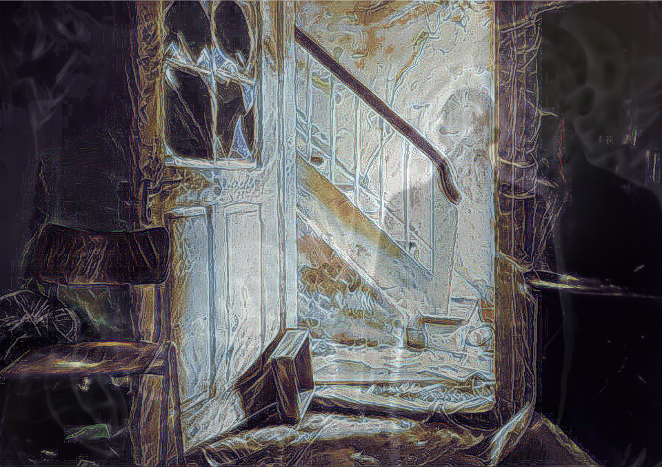
While everyone mostly agreed this was a good piece it didn’t feel very cyberpunky; in fact it felt more like it belonged in a horror card game. The idea of the shadow was praised, though, so I decided that had to stay, but went back to the drawing board for the composition, this time looking for abandoned offices. After rifling through most of the stock images meant for slideshows about team-building, I happened upon a photo of an empty room with filing cabinets open and emptied, and I tried to make that work.
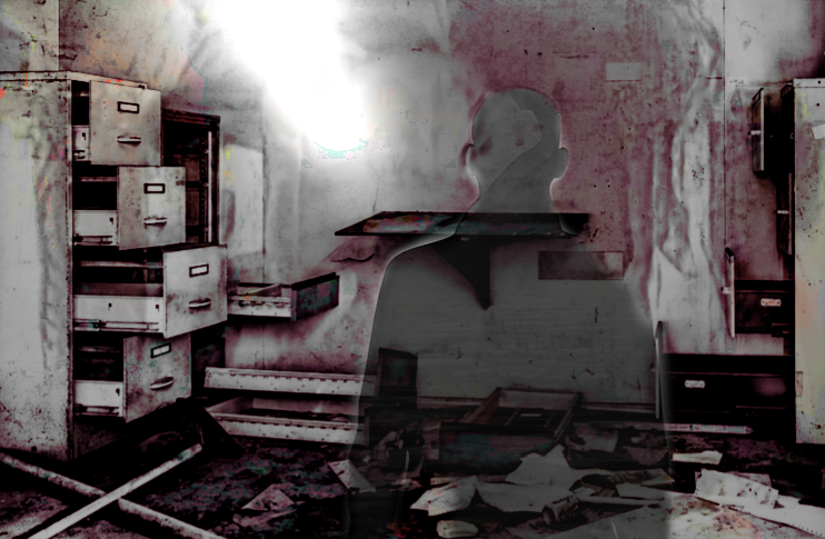
The shadow here felt too solid, and it intersected with the filing cabinet creating a visual tension point. The red tones, while cool, also felt too saturated, and the greys needed to come out more.
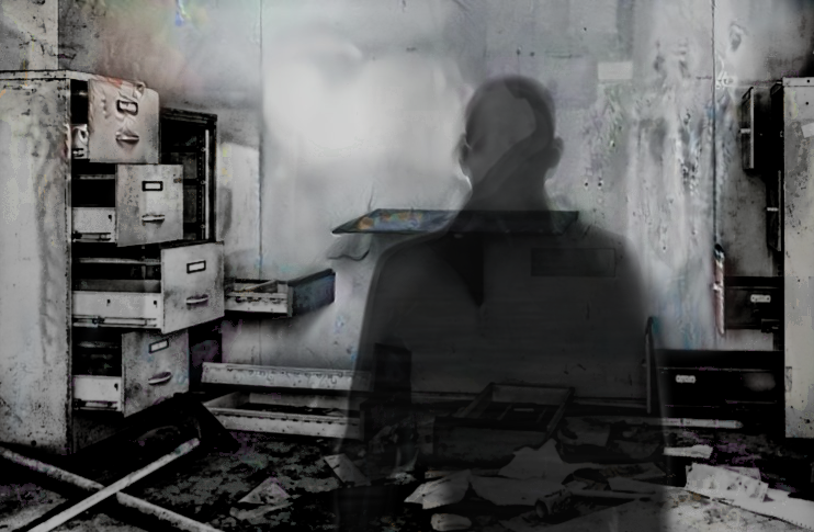
A few iterations later, perhaps feeling too much like a slab of grey and with the visual tension point still there, the awesome Pat Burk gave me a small list of ideas for how to polish it up.
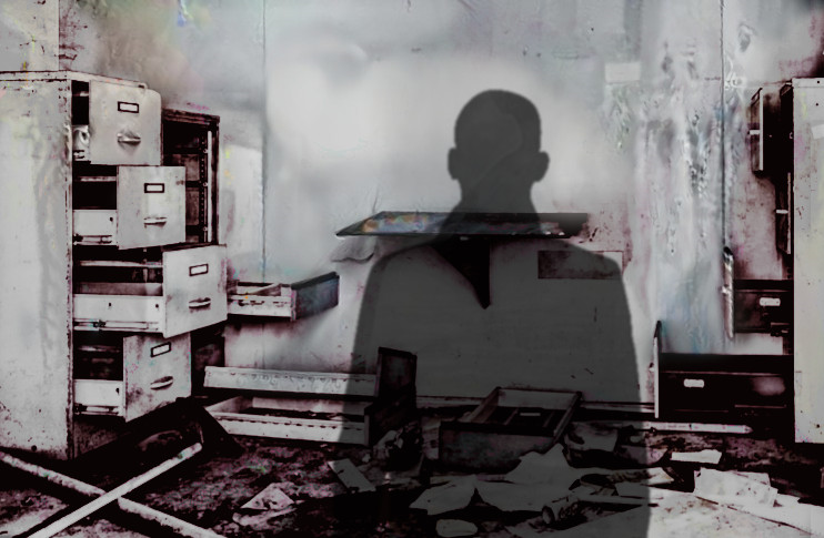
These involved bringing some of the red back in and finally, after moving the figure and lowering its opacity, it was almost there but still not quite right.
“Make the greys more overexposed.”
“Like this?”
“Even more.”
And after a couple of overexposing sessions we got:
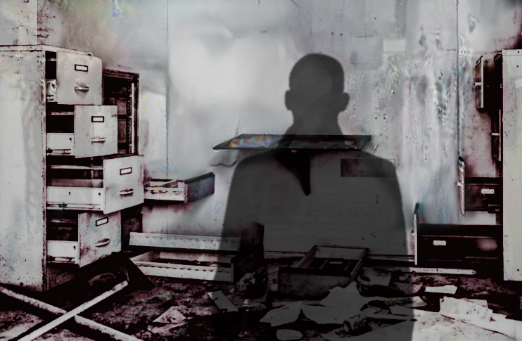
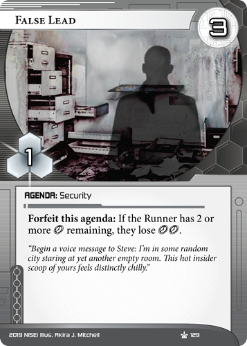
This is probably my favorite piece I’ve done to date, I’m very proud of it, and when compared to Congratulations! it blows it out of the water. This piece got a lot of praise internally for how atmospheric it feels.
False Lead also happens to be one of my favorite agendas to try and fit into decks – the effect is super rude in conjunction with cards like Hard-Hitting News, or Jemison Astronautics.
I hope you enjoyed this brief look through the art’s development!
Nicita
Before I start talking about DeepDream or card spoilers, I have a confession to make: I am very much not a digital artist. In my free time, I do embroidery and watercolours with questionable artistic value, but I didn’t know the first thing about digital art when NISEI got me on board as their Moderation Coordinator.
In the first weeks of NISEI, there was a lot of discussion about how to handle creating hundreds of pieces of art a year on a volunteer organisation’s budget. DeepDream seemed like a viable option for creating beautiful art depicting cyberspace (Architect Deployment Test, anyone?).
Because we would have needed several Kremblers to produce the amount of art needed, and DeepDream sounded intriguing and the moderation often didn’t take as much time coordinating as I had to spare, I ordered the cheapest drawing tablet I could find and gave digital drawing a try.
During the last year, I’ve learned a lot, but more than anything, the excitement about seeing my art printed on cards has been amazing.
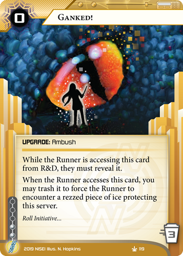
The card I’m introducing in this article is Ganked!.
Originally, Ganked! had a very different art brief: “Doorframe of yellow light spilling into a darkened frame, outline of some sort of medium-tier monster emerging out of it can be seen in darker light (possibilities like the scary clown from the alt-art pop-up, or the amazing Sandman art).”
Usually, I like to paint something first and then use DeepDream to make it look more cyberpunky. In this case, I drew a figure resembling Slenderman over a picture I took:
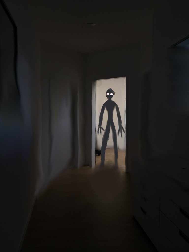
After trying a few different things in DeepDream, I realised that I’d gotten myself into a cul-de-sac. The painting was going nowhere, and I was really unhappy with it.
Because this card takes place within a virtual videogame environment, I thought a bit more about monsters in videogames. One of my favourites is and always will be Skyrim and its epic (and sometimes annoying) dragon battles. I started sketching, and soon arrived at something I was much happier with than I’d been with my Slendermonster:
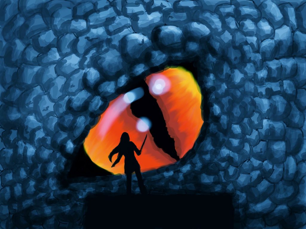
It had clear lines and bright colours, which can be very helpful when putting art through a program like DeepDream. A few spins through the program later, it looked like this:
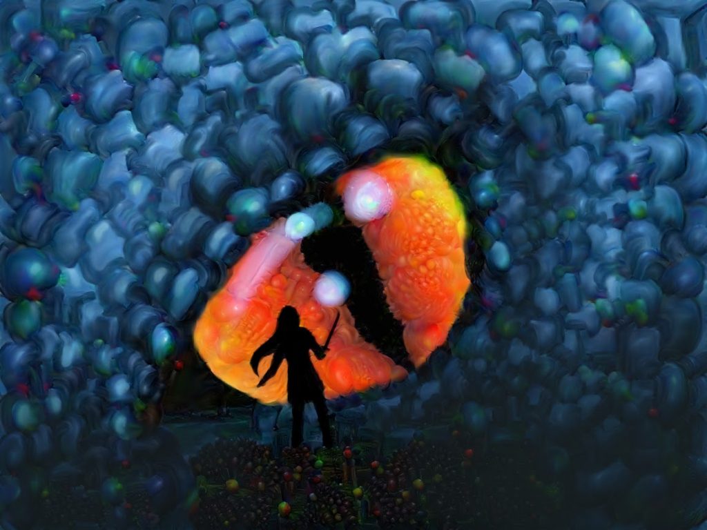
Unfortunately, the Runner silhouette didn’t really pop on the scale of a card, so Krembler and Pat had some advice for making it stand out more:
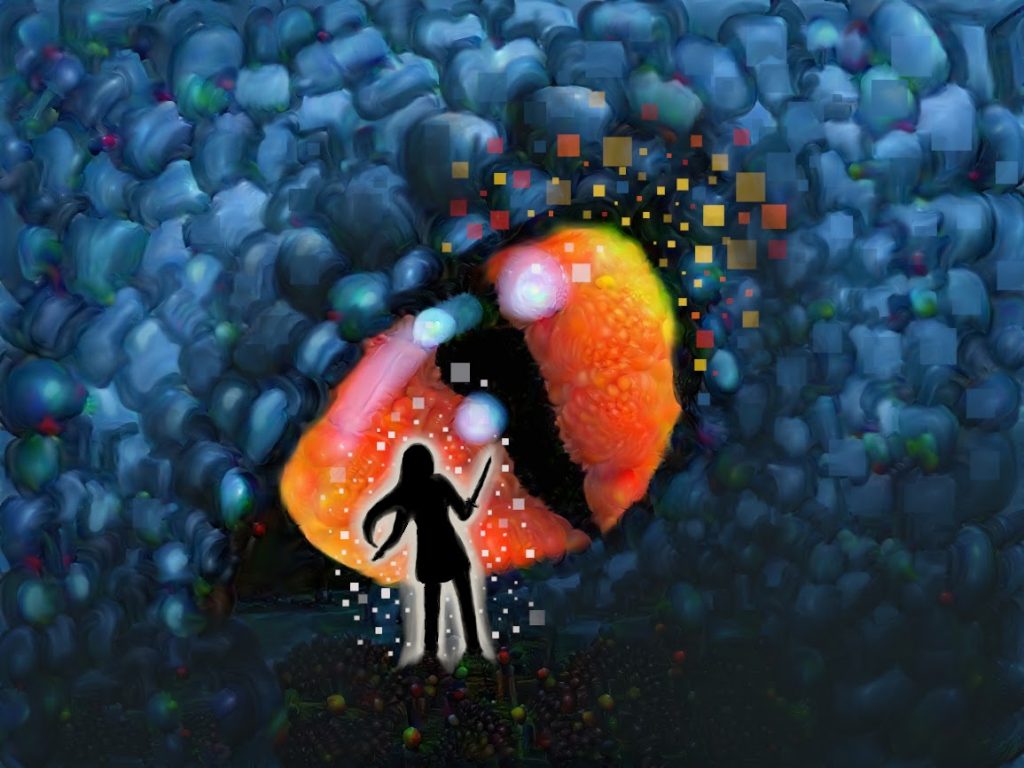
And here we go! This might not be the “mid-tier” monster from the art brief anymore, but let’s be honest: who of us videogamers hasn’t from time to time rushed into a boss fight they weren’t ready for?
Before you get to see the whole card spoiler, I want to thank my Papa (who works with lasers) for helping me take tons of pictures of laser effects. A lot of art features those effects (SYNC Rerouting being one) and would not have looked half as good without him.
Danke Papa!
Zoe
For our last spoiler today, I’m excited to share a Weyland asset called Wall To Wall. Several Weyland cards this set tie in with the Earth Station ID, including this look at what happens when you give a megacorporation a captive audience. Our initial art description: “The lobby/concourse inside Earth Station, shot from the side of a lone figure walking across to the reception desk. In the background are dozens of large holo screens all advertising the same trip to the Earthrise Hotel. Scene is brightly lit, mood like an airport.”
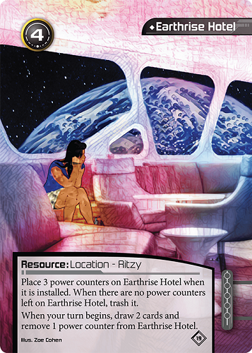
Earthrise Hotel has become a bit of a pet project for me. You can see part of my interpretation already in the latest Game Night Kit, but this illustration was the beginning of that process.
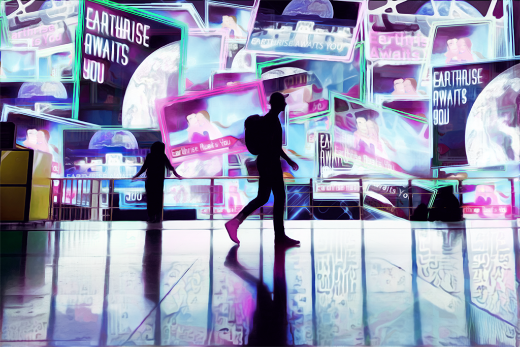
To create Wall to Wall, I began with an image of a traveler walking across an airport concourse. I removed the background and tore the roof off the airport to create more room for the holograms, then set to work creating ads. Krembler produced an image of a happy couple on vacation, while I focused on pieces that communicated the view from the moon. I felt the “Earthrise Awaits You” slogan appropriately creates a sense of inevitability and vague threat appropriate to an inescapable targeted ad campaign. Once the space was filled with ads, all that remained was a couple dozen layers of DeepDreaming.
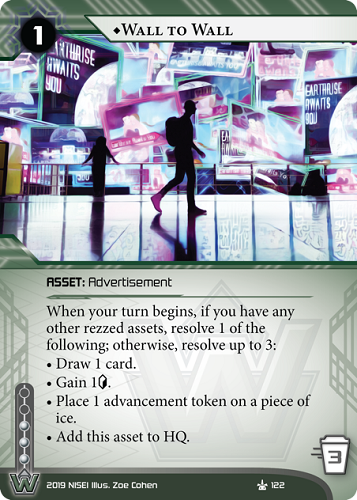
I spent a lot of time on this piece, and learned a ton from the process. In addition to my art team peers, I want to give a huge thank you to our outgoing art coordinator – Patrick Burk (@bluehg). His artistic mentorship introduced me to a whole new passion and changed my life, and his presence will be missed by all of us at NISEI.
